13. You Might Be Seeing Colors Wrong, Here’s Why
- Keeper of #fc94af

- Apr 22
- 4 min read
Updated: May 13
I argued over a color swatch with a colleague once. I looked at it and said, “That’s obviously pink.” She immediately replied, “No way, it’s peach.”
We were both staring at the same sample. Under the same light. Yet somehow we saw two different colors. I even held the swatch closer to the window, hoping that would settle it. Somehow, it only worsened our squabble.
It sounds strange at first. How can two people look at the same color and come away with completely different answers? But it happens all the time. And usually, neither person is wrong. Colors aren’t as fixed as we think they are.
Light, surrounding shades, and even the way our eyes process warmth and tone can change how a color feels in the moment.
You Might Be Seeing Colors Wrong, Here’s Why: The Truth About Color
Here’s something most people don’t realize. Color doesn’t exist on its own. What you’re actually seeing is light reflecting off a surface. Your eyes pick up that light, and your brain turns it into what you recognize as color. So color is not just about the object.
It’s about:
Light
Environment
Your eyes
Your brain
Change any one of these, and the color can look different.
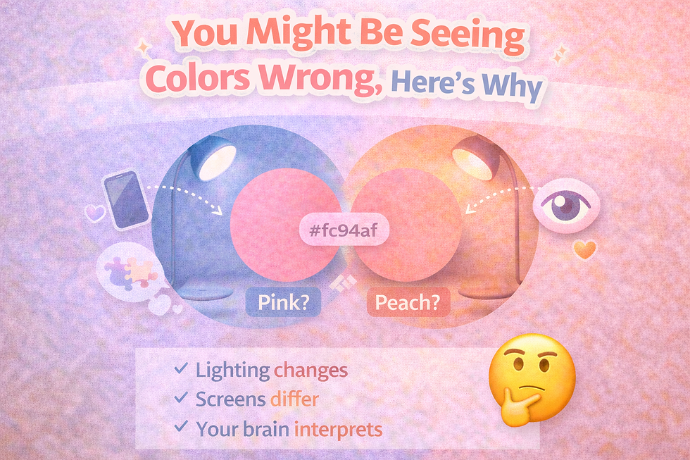
1. Lighting Changes Everything
Warm Lighting
Think of a lamp at night.
It adds a yellow tone
Colors feel warmer
Pink shades may look more peach
Cool Lighting
Think of bright white lighting.
It adds a blue tone
Colors feel sharper
Warm tones may look more pink
Natural Light
Sunlight changes throughout the day.
Morning → cooler
Afternoon → neutral
Evening → warm
So a color like #fc94af can look pink in the morning and peach in the evening. Same color. Different light.
Read more: How lighting changes the way you see color at home: The science of optical shifts during the day.
2. Your Screen Is Changing the Color
If you’re looking at color online, your screen is not neutral.
Different Devices, Different Results
Phones often boost color
Laptops may look flatter
Monitors can shift warm or cool
So what you see on one screen may not match another.
Settings Matter Too
Brightness
Contrast
Night mode
These all affect how color appears. Night mode, for example, warms the screen, making colors look more orange or peach.
3. Your Brain Is Filling in the Gaps
Your eyes don’t do all the work. Your brain is constantly interpreting what you see.
It Uses Context
If a color is surrounded by cool tones, your brain may see it as warmer. If it’s surrounded by warm tones, it may look cooler.
It Wants Simple Answers
Your brain likes categories:
Pink
Peach
Red
Orange
But some colors don’t fit neatly into one box. So your brain makes a quick decision.
And that decision can be different for each person.
4. Surrounding Colors Trick You
Try this simple test. Look at a soft pink-peach color. Now place it next to bright pink. Suddenly, it looks more peach. Now place it next to orange. Now it looks more pink. The color didn’t change. Your perception did.
5. Not Everyone Sees Color the Same Way
This part surprises people.
Small Differences in Vision
Some people are more sensitive to:
Warm tones
Cool tones
Contrast
So one person may notice the pink side more. Another may notice the peach side.
Eye Fatigue
If your eyes are tired, colors can look duller or slightly off. This happens more than you think, especially after long screen use.
6. Memory and Experience Play a Role
Your brain remembers colors.
Example
If you associate pink with a certain shade, your brain may try to match what you see to that memory.
If the color doesn’t match perfectly, you hesitate. That’s why some colors feel “off” even when they’re technically correct.
7. Color Is Not Absolute
We often treat color like it’s fixed. But it’s not. A color like #fc94af sits between pink and peach.
That means:
It can look different in different conditions
It can be interpreted in more than one way
And that’s normal.
Why This Keeps Going Viral
You’ve probably seen viral debates about color.
People arguing about:
Pink vs peach
Blue vs green
Light vs dark
These moments spread because they challenge a simple belief: That we all see the same thing. But we don’t.
And that’s fascinating.
Why Your Brain Keeps Looking Again
Have you noticed this? You don’t just glance at a confusing color. You keep looking.
Why?
Your brain wants certainty.
It wants to decide:
Pink or peach
One or the other
But when the answer isn’t clear, your brain keeps trying. That’s what makes these colors so engaging.
How to See Colors More Clearly
You can’t control everything. But you can reduce confusion.
1. Check Different Lighting
Look at the color:
During the day
At night
2. Use Multiple Screens
Compare:
Phone
Laptop
Another device
Read more: Hex vs RGB vs HSL: A technical guide to understanding how digital colors are actually built.
3. Compare With Known Colors
Place it next to:
A clear pink
A clear orange
This helps your brain understand where it sits.
4. Take a Break
If you’ve been staring too long, step away.
Come back with fresh eyes.
The Bigger Idea
This isn’t just about color. It’s about perception.
What you see is shaped by:
Light
Context
Your environment
Your brain
Once you understand that, things start to make more sense.
You might be seeing colors wrong, here’s why: a recap. Color isn’t a fixed answer. It’s more like a conversation between light, your eyes, and your surroundings.
You pink, therefore you are.


Comments