9. 10 Beautiful Rooms Designed Around #fc94af
- Keeper of #fc94af

- Apr 18
- 3 min read
Updated: May 13
I remember coming across #fc94af while planning my bedroom and not knowing what to call it. At my first glance, it felt like pink. Then, under a different light, it leaned peach. It never fully committed to either. And that was exactly what drew me in.
I tested it in a few corners of the room. Morning light made it feel soft and airy. Evening light gave it a warmer, cozy glow. It didn’t overpower anything, yet it never faded into the background. It simply adapted.
That’s when it hit me. This color doesn’t demand attention. It earns it. Here are 10 beautiful room inspirations built around #fc94af. 10 beautiful ways this subtle shade comes to life at home.

1. The Soft Minimal Living Room
Start simple.
Beige sofa
Light wood coffee table
#fc94af cushions and throw
The color adds warmth without taking over. The space feels clean, calm, and easy to relax in. Perfect if you like a minimalist look with a soft touch.
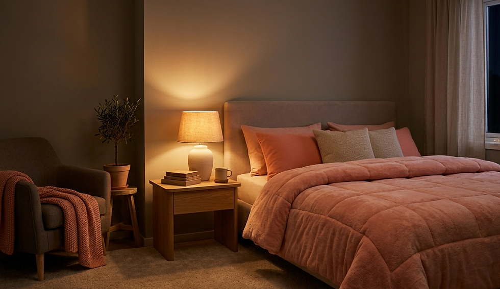
2. The Cozy Bedroom Retreat
Use #fc94af where comfort matters most.
Soft pink-peach bedding
Warm bedside lighting
Neutral walls
At night, the color leans more peach, making the room feel warmer and more inviting. It’s the kind of space you don’t want to leave.

3. The Japandi-Inspired Corner
Keep things tranquil and balanced.
Low wooden furniture
Linen textures
A single #fc94af cushion
The color acts as a gentle highlight without shattering the calm. Modest, but intentional.
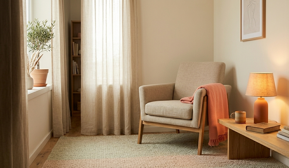
4. The Pastel Reading Nook
Create a small escape.
Armchair in a neutral tone
Soft pastel rug
#fc94af lamp or throw
Add warm lighting, and the space feels like a quiet nook just for you.

5. The Modern Dining Space
Dining areas don’t need bold colors to feel inviting.
Light wood table
Cream chairs
#fc94af table runner or decor
The color adds warmth without distracting from the space. Subtle, but effective.
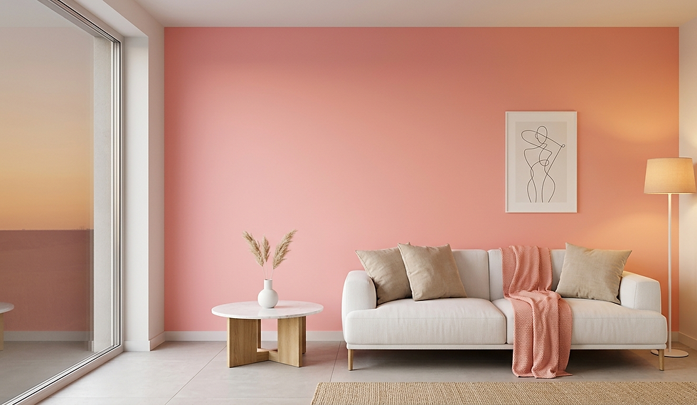
6. The Soft Pink Accent Wall
If you want a bigger impact, try a wall.
One #fc94af feature wall
White or beige furniture
Minimal decor
During the day, it feels soft and fresh. At night, it becomes warmer and more relaxed. It changes with the mood of the room.
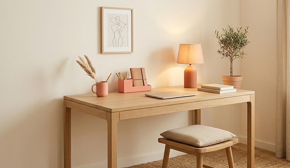
7. The Calm Home Office
Workspaces don’t have to feel cold.
Neutral desk setup
Soft pink-peach accessories
Warm lighting
#fc94af imbues a sense of calm, helping the space feel less stressful.
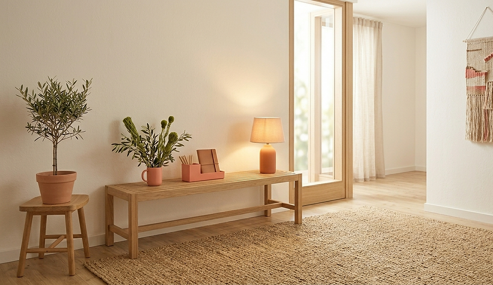
8. The Warm Entryway
First impressions matter.
Light walls
Small bench or console
#fc94af decor pieces
Even a small touch of color can make the space feel more welcoming.
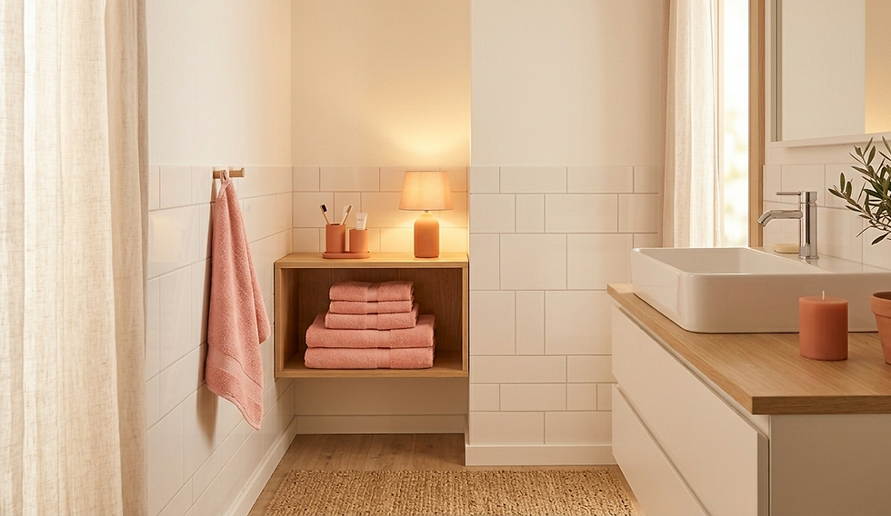
9. The Bathroom With a Soft Glow
Bathrooms often use cool tones.
Try something different.
White tiles
Soft pink towels
Warm lighting
The result feels softer, less clinical, and more relaxing.

10. The Balanced Pink-Peach Living Space
Mix both sides of the color.
Neutral base
#fc94af accents
A few peach or terracotta pieces
This creates depth while keeping everything soft and cohesive.
Why #fc94af Works in So Many Spaces
There’s a reason this color fits everywhere.
1. It’s Not Too Strong
Bold colors can dominate a room. #fc94af doesn’t. It blends in while still exuding personality.
Read more: A complete guide on how to use #fc94af in interior design for bedrooms, kitchens, and more.
2. It Changes With Light
This makes the space feel more dynamic.
Day → slightly pink
Night → slightly peach
It never feels flat.
3. It Pairs Easily With Neutrals
You don’t need complicated color schemes.
Read more: Hex vs RGB vs HSL: The exact technical values you need to match these room designs perfectly.
It works naturally with:
White
Beige
Light wood
How to Start Using It
If you’re unsure, don’t overthink it.
Start Small
Try:
Cushions
Throws
Small decor
See how it feels in your space.
Pay Attention to Lighting
Check the color:
During the day
At night
This helps you understand how it behaves.
Keep It Balanced
Let the color support the space, not dominate it.
Read more: How to create a calm home with soft pastel colors: The psychology behind these relaxing spaces.
Common Mistakes to Avoid
Even soft colors can go wrong.
1. Using Too Much
Too much of one tone can feel overwhelming.
Balance it with neutrals.
2. Mixing With Bright Colors
Bright reds or oranges can clash.
Stick with muted tones.
3. Ignoring Texture
Flat spaces feel dull.
Add:
Fabric
Wood
Ceramics
This creates depth without adding noise.
You don’t need bold colors to create a beautiful home. Sometimes, the best spaces are built on quiet tones. #fc94af is one of those colors. It’s soft. It’s warm. It adapts to your space instead of controlling it.
Start with one small change. A cushion. A lamp. A soft accent.
The pink of perfection.


Comments