20. How to Make Any Room Look Softer Using Color Alone
- Keeper of #fc94af

- Apr 29
- 4 min read
Updated: May 14
A few years ago, I visited a friend’s new home office. On paper, it was perfect. Expensive ergonomic Herman Miller, a sleek minimalist desk, and massive windows. But five minutes into our coffee, I felt a pressing urge to leave. The walls were a stark, "hospital" white, and the overhead LED lighting made every corner look clinical. It felt like sitting inside a giant fluorescent bulb.
Contrast that with a small vintage boutique I stumbled upon in a tranquil nook. The space was tiny, but the walls were painted in a soft, warm hue. A shade close to that dreamy pink-peach #fc94af. Even with just a few simple chairs, I felt like I could have stayed there for hours. I realized then that you can buy the best furniture in the world, but you can't "buy" comfort if the walls are fighting you.
The atmosphere isn't in the price tag. It's in the palette.
How to Make Any Room Look Softer Using Color Alone:
What Does a “Soft” Room Actually Feel Like?
Before changing anything, it helps to know what you’re aiming for.
A soft room feels:
Calm on your eyes
Warm but not heavy
Balanced, not busy
Nothing stands out too aggressively. Everything blends in a gentle way. Think of a cozy café or a quiet bedroom. That’s the feeling.
Why Color Has Such a Big Impact
Color controls how light behaves in a space.
It affects:
Brightness
Contrast
Mood
So even if everything else stays the same, changing the color can completely change how the room feels.
1. Choose Softer Base Colors
Start with your main color.
This could be:
Walls
Large furniture
Curtains
What to Look For
Instead of strong colors, go for:
Warm whites
Soft beige
Muted pastels like #fc94af
Why It Works
Soft colors:
Reflect light gently
Reduce harsh contrast
Make the space feel more relaxed
2. Avoid High Contrast
Sharp contrast makes a room feel more intense.
Example
Black and white → bold, high contrast
Beige and soft pink → low, gentle contrast
What to Do Instead
Keep your colors closer in tone. Let them blend rather than clash.
The Result
Your eyes move smoothly across the room instead of jumping around.
3. Use Warm-Toned Colors
Warm tones instantly soften a space.
Good Options
Cream
Light wood tones
Soft peach or pink tones like #fc94af
What to Avoid
Very cool, bluish tones can feel:
Cold
Sharp
Less inviting
Balance Tip
You can still use cool tones, just keep them muted and minimal.
4. Stick to a Simple Palette
Too many colors create noise. Noise makes a room feel busy, not soft.
Keep It Simple
Use:
2 to 4 colors only
Example Palette
Warm white
Beige
Light wood
Why It Works
Fewer colors create a smoother visual flow.
5. Add One Gentle Accent Color
This is where #fc94af shines.
How to Use It
Add it in small ways:
Cushions
Throws
Decor pieces
Why It Works
A soft accent adds warmth without overwhelming the space.
6. Match Colors to Your Lighting
Lighting changes everything.
Warm Lighting
Makes colors feel softer
Enhances peach tones
Cool Lighting
Makes colors feel sharper
Can reduce softness
What to Do
If you want a soft look:
Use warm bulbs
Avoid harsh white light
7. Choose Muted Versions of Colors
Even bright colors can be softened.
Instead of:
Bright red
Try:
Dusty rose
Instead of:
Strong orange
Try:
Soft peach
Why It Works
Muted colors feel more relaxed and less intense.
8. Let Colors Blend, Not Compete
In a soft room, colors should support each other.
What This Means
No single color should dominate
Everything should feel connected
Easy Trick
Pick colors from the same family.
For example:
Pink-peach tones
Beige variations
9. Use Color to Soften Edges
Color can reduce the feeling of “hard edges” in a room.
How
Use similar tones across:
Walls
Furniture
Decor
Result
The room feels more continuous, less broken up.
10. Keep Whites Warm, Not Stark
White can make or break the softness of a room.
Avoid
Bright, pure white
Use Instead
Warm white
Cream
Why It Matters
Cool white can feel harsh. Warm white feels softer and more natural.
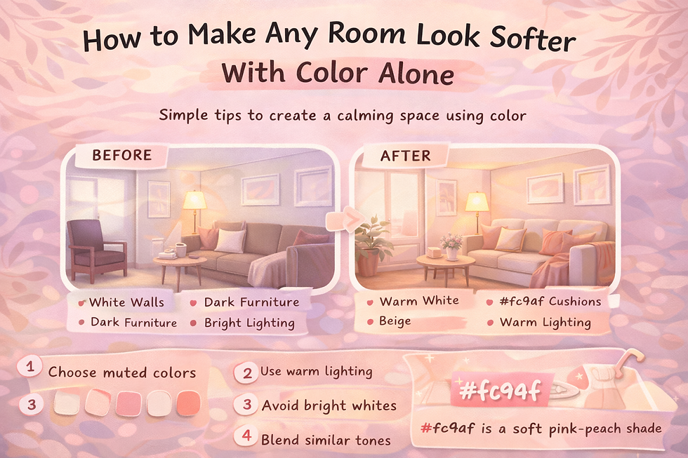
A Simple Room Transformation Example
Let’s imagine a basic living room.
Before
White walls
Dark furniture
Bright lighting
Feels:
Sharp
Slightly cold
After
Warm white walls
Beige sofa
#fc94af cushions
Warm lighting
Now it feels:
Calm
Cozy
Soft
Same room. Different color choices.
Read more: Beyond aesthetics: How to create a calm home with soft pastel colors for ultimate relaxation.
Common Mistakes to Avoid
Even small choices can affect the result.
1. Using Too Many Bright Colors
This adds visual stress.
2. Ignoring Lighting
Even soft colors can look harsh under strong white light.
3. Mixing Too Many Styles
Stick to a consistent mood.
4. Forgetting Balance
Too much of one color can feel overwhelming.
Why Soft Rooms Feel Better
There’s a reason people prefer softer spaces.
They Reduce Visual Stress
Your eyes don’t have to work as hard.
They Feel More Relaxing
Soft tones create a calm environment.
They Feel More Natural
Nature rarely uses harsh contrast. Soft spaces feel more organic.
The Subtle Power of Colors Like #fc94af
Colors like #fc94af are perfect for this.
They:
Add warmth
Stay gentle
Adapt to light
Read more: See it in action: 10 beautiful rooms designed around #fc94af that master the soft aesthetic.
How to make any room look softer using color alone: A recap. Start with color. Soften the tones. Reduce the contrast. Let everything blend a little more. Sometimes, the smallest color shift can completely change how a space feels.
Pink outside the box!


Comments