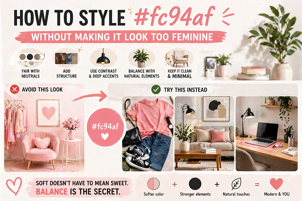
26. What Colors Go With Pink-Peach in Small Spaces
- Keeper of #fc94af

- May 5
- 4 min read
Updated: May 14

I’ll never forget my first apartment—a "studio" that was essentially a walk-in closet with a window. I tried painting it a trendy, deep navy, thinking it would look sophisticated. Instead, I felt like I was living inside a shoebox. It was heavy, cramped, and honestly, a bit suffocating.
After a week of bumping into furniture in the dark, I repainted everything in a soft, pink-peach tone similar to #fc94af. The transformation was instant. It was as if the walls had stepped back to give me some breathing room. The apartment didn't just look more spacious. It felt lighter and easier to exist in.
That’s the magic of these special tones. They are incredibly flexible. They provide enough warmth to give a tiny room personality without the "cluttered" feeling that bolder colors create. In a small space where every square inch is precious, a shade like #fc94af acts as a canvas that opens everything up.
What Colors Go With Pink-Peach in Small Spaces:
Why Pink-Peach Works So Well
It Reflects Light Gently
#fc94af doesn’t absorb too much light.
That means:
The room feels brighter
The space feels more open
It Sits Between Warm and Soft
It’s not too bold. Not too neutral. So it adds warmth without making the room feel heavy.
It Adapts to Its Surroundings
Depending on lighting and nearby colors, it can look:
More pink
More peach
That flexibility makes it easier to style.
Read more: Pink or Peach? A simple guide to identifying the exact tones that will brighten up a small room.
The Goal in Small Spaces
When working with limited space, your color strategy should do three things:
Make the room feel bigger
Keep the mood calm
Avoid visual clutter
Every color you add should support those goals.
1. Warm White, Your Best Starting Point
If you only choose one pairing, make it this.
Why It Works
Warm white:
Keeps things clean
Reflects light
Softens the pink-peach tone
How to Use It
Walls in warm white
#fc94af as accents, cushions, or decor
The Effect
The room feels:
Airy
Light
Calm
2. Beige for a Soft, Cozy Base
Beige and pink-peach are a natural match.
Why It Works
Both colors are warm and muted. They blend instead of competing.
How to Use It
Beige sofa or curtains
#fc94af cushions or throws
The Effect
The space feels:
Cozy
Relaxed
Balanced
3. Light Wood to Add Depth
Color alone is not enough. You need texture.
Why It Works
Light wood:
Adds warmth
Grounds the space
Breaks up flat surfaces
How to Use It
Coffee table
Desk
Shelves
The Effect
The room feels more natural and less “flat.”
4. Soft Gray for Subtle Contrast
If everything is too warm, the room can feel washed out. That’s where soft gray helps.
Why It Works
Gray adds:
Gentle contrast
A slightly cooler balance
How to Use It
Rugs
Lamps
Small decor
The Effect
The space feels more defined without losing softness.
5. Sage Green for Freshness
You need one color that feels alive.
Why It Works
Sage green:
Balances warm tones
Adds freshness
Feels calm, not loud
How to Use It
Plants
Cushions
Wall art
The Effect
The room feels:
Lighter
More breathable
More complete
6. Cream Instead of Pure White
Not all whites are the same.
Why It Works
Cream:
Feels warmer than pure white
Blends better with pink-peach
How to Use It
Walls
Bedding
Curtains
The Effect
The space feels softer and less sharp.
7. Muted Blue for a Gentle Contrast
If you want a bit more variation, try soft blue.
Why It Works
Muted blue:
Adds contrast without being harsh
Balances warmth
How to Use It
Small decor pieces
Artwork
Textiles
The Effect
The room feels more layered and interesting.
What to Avoid in Small Spaces
Some color choices can make your room feel smaller.
1. Too Many Dark Colors
Dark tones:
Absorb light
Make the room feel tighter
2. High Contrast Combinations
Sharp contrasts:
Break visual flow
Make the space feel busy
3. Too Many Colors at Once
More colors = more visual clutter. Stick to 2 to 4 colors max.
A Simple Color Formula That Works
If you’re unsure, follow this:
60% Base
Warm white or cream
30% Secondary
Beige or light wood
10% Accent
#fc94af + one small contrasting tone
Why It Works
This keeps everything balanced and easy on the eyes.
Lighting Makes a Big Difference
Color doesn’t work alone.
Warm Lighting
Enhances peach tones
Makes the room feel cozy
Cool Lighting
Brings out pink tones
Feels sharper
Tip
Use warm lighting if you want the space to feel softer.
Read more: Lighting Secrets: How to prevent your small space colors from changing throughout the day.
Real Example: Small Living Room Setup
Let’s put it all together.
Setup
Warm white walls
Beige sofa
Light wood table
#fc94af cushions
Small sage plant
Warm lamp
Result
The room feels:
Open
Calm
Slightly warm and inviting
Real Example: Small Bedroom Setup
Setup
Cream bedding
Soft pink-peach accents
Light wood side table
Sheer curtains
Warm lighting
Result
The space feels:
Relaxing
Soft
Easy to unwind in
Why This Color Works Long-Term
Trendy colors come and go. But soft tones like #fc94af stay relevant.
They Adapt
They look different depending on light and surroundings.
They Don’t Overwhelm
You won’t get tired of them quickly.
They Fit Many Styles
Minimal
Cozy
Modern
What Colors Go With Pink-Peach in Small Spaces: A recap. Small spaces don’t need more things. They need better choices. Start with a soft, flexible color like #fc94af. Then build around it with light, warm, and balanced tones. Keep it simple. Keep it soft. And you’ll notice something interesting. The space won’t just look bigger.
It will feel better to live in.


Comments