23. How to Style #fc94af Without Making It Look Too Feminine
- Keeper of #fc94af

- May 2
- 4 min read
Updated: May 14
I remember the first time I tried to incorporate #fc94af into a professional branding project. I loved the energy of the color on its own. It felt modern and fresh. But the moment I applied it to a full layout, I panicked. It looked like a greeting card for a bakery. It felt too "sweet," too delicate, and frankly, a bit too feminine for the balanced, minimalist look I was aiming for.
I almost scrapped the whole palette, thinking the color was just too "soft" to be taken seriously. But instead of giving up, my designer colleague started toying with contrast. She paired that peach-pink with sharp, charcoal grays and raw wood textures. Suddenly, the "sweetness" disappeared, and the color became grounded, sophisticated, and even a little bit edgy.
That’s the thing about these tones. They are incredibly deceptive. If you leave them on their own, they can feel like a bowl of candy, but they are actually remarkably flexible. The styling makes all the difference. When you learn to balance a shade like #fc94af with the right textures and tones, it stops being "just a pretty color". And it starts feeling like a deliberate, minimal design choice.
First, Understand the Color
#fc94af sits right between pink and peach.
That means it has:
Warm undertones
Soft saturation
A gentle, light feel
On its own, it can lean feminine. But paired the right way, it can feel neutral, modern, and even bold in a quiet way.
The Key Idea: Balance
You don’t need to remove the softness. You just need to balance it.
Think of it like this:
Soft color → grounded elements
Warm tone → contrast
Light shade → structure
Once you balance those three things, the look shifts completely.
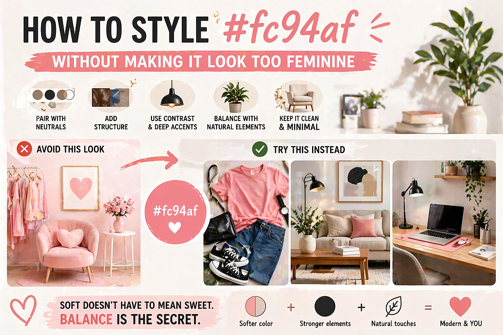
1. Pair It With Neutrals
This is the easiest way to tone it down.
Best Neutral Pairings
Beige
Taupe
Warm gray
Off-white
Why It Works
Neutrals absorb some of the softness. They keep the color from becoming the focus of everything.
Example
#fc94af shirt
Beige trousers
White sneakers
Simple. Balanced. Not overly feminine.
Read more: Minimalist Color Palettes: How to pair #fc94af with neutral tones for a clean, modern aesthetic.
2. Add Structure Through Materials
Soft colors feel softer when paired with soft textures. So change the texture.
Try These Materials
Denim
Leather
Canvas
Raw wood
Why It Works
Structure adds weight. It grounds the color and gives it a more neutral feel.
Example
#fc94af top
Denim jacket
Dark jeans
Now the look feels more casual and balanced.
3. Use Dark Contrast (But Keep It Minimal)
A little contrast goes a long way.
Add Small Dark Elements
Black shoes
Dark frames
Charcoal accents
Why It Works
Dark tones create definition. They stop the color from feeling too soft or washed out.
Tip
Don’t overdo it. Just one or two darker elements is enough.
4. Avoid “Too Many Softs” Together
This is where most people go wrong.
What to Avoid
Pastel on pastel on pastel
Too many pink tones together
Why It Doesn’t Work
Everything blends too much. The result feels overly delicate and unbalanced.
What to Do Instead
Mix soft with grounded.
Example
#fc94af cushion
Beige sofa
Wooden table
Now the softness feels intentional, not overwhelming.
5. Choose Clean, Minimal Shapes
Design matters just as much as color.
Go For
Straight lines
Simple silhouettes
Clean edges
Avoid
Frills
Excessive curves
Overly decorative shapes
Why It Works
Minimal shapes make the color feel modern instead of romantic.
6. Pair With Muted, Not Bright Colors
If you add more color, keep it controlled.
Good Pairings
Olive green
Dusty blue
Soft gray
Avoid
Neon tones
Very bright colors
Why It Works
Muted colors keep the palette calm and balanced.
7. Let Lighting Do the Work
Lighting can shift how #fc94af feels.
Warm Lighting
Brings out peach tones
Feels cozy
Cool Lighting
Brings out pink tones
Feels sharper
Tip
Use lighting to control the mood instead of changing the color.
8. Keep It as an Accent, Not the Base
If you’re unsure, don’t make it the main color.
Use It In
Accessories
Small decor
Highlights
Why It Works
A small amount adds warmth without dominating the look.
Example
Neutral room
#fc94af cushions or artwork
The color enhances the space instead of defining it.
9. Balance With Natural Elements
Nature helps soften the softness.
Add
Plants
Wood
Stone textures
Why It Works
Natural elements add depth and contrast. They make the space feel more grounded.
10. Think “Calm,” Not “Cute”
This mindset shift helps a lot.
Instead of Asking
“Does this look cute?”
Ask:
“Does this feel calm and balanced?”
Why It Matters
The same color can feel completely different depending on intention.
Real-Life Styling Examples
Let’s make this practical.
Outfit Example
#fc94af tee
Dark jeans
White sneakers
Black watch
Feels casual and clean.
Living Room Example
Beige sofa
Wooden table
#fc94af cushion
Warm lighting
Feels cozy but not overly soft.
Desk Setup Example
Neutral desk
Minimal decor
#fc94af mouse pad
Matte textures
Feels calm and focused.
Read more: Designing for Serenity: How to create a calm home for everyone using soft pastel palettes.
Common Mistakes to Avoid
Even small choices can shift the tone.
1. Overusing Pastels
Too many soft colors make the space feel flat.
2. Ignoring Contrast
Without contrast, everything blends too much.
3. Using Only Soft Textures
Soft + soft + soft = overly delicate. Mix in structure.
Why This Approach Works
You’re not removing the softness. You’re shaping it.
The Result
More balanced
More versatile
More modern
Add structure. Add contrast. Keep things simple. And you’ll start to see something different. Not soft in a delicate way. But soft in a calm, confident way.


Comments