5. How to Use #fc94af in Interior Design
- Keeper of #fc94af

- Apr 14
- 4 min read
Updated: May 3

I remember the first time I came across #fc94af while choosing finishes for my daughter's room. Princess Elsa's reign ended. I thought, “Okay, that’s pink.” No-nonsense. Then I saw it again in the office, and suddenly it felt warmer, almost peach. Later in the evening, it softened even more. It also looked different on my iPhone and MacBook. Like it couldn’t quite decide what it wanted to be.
This color doesn’t sit around, waiting. It shifts with the room, with the light, with the mood. And that’s exactly why it works so well in interior design. It doesn’t clamor for attention. It quietly blends in, then surprises you.
If you’re trying to create a home that feels calm, warm, and just a little out of the spectrum, this is a lovely place to begin.
#fc94af is a soft pink-peach tone.
It has:
Enough red to feel warm
Enough softness to feel calm
Just enough ambiguity to stay interesting
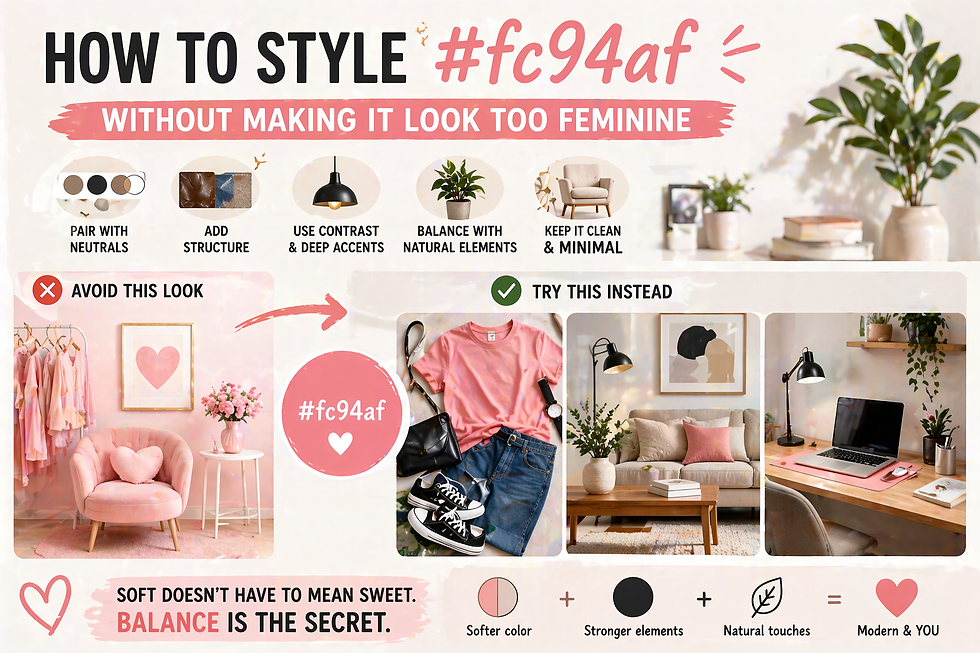
It’s not blaring. It’s not overly feminine. It’s not too trendy. It sits in the background, shaping the mood without taking over.
Why Designers Love This Color
There’s a reason you’ll see shades like #fc94af in modern homes.
1. It Feels Warm Without Being Heavy
Dark warm colors can feel intense. This one doesn’t. It gives warmth without making the room feel smaller or darker.
2. It Works in Different Lighting
During the day:
It leans soft pink
At night:
It shifts toward peach
That natural change makes the space feel more alive.
3. It Blends Easily With Neutrals
#fc94af pairs well with:
White
Beige
Light wood
Cream
That makes it easy to use, even if you’re not confident with color.
Where to Use #fc94af in Your Home
You don’t need to repaint your entire house. Start small. See how it feels.
1. Walls (If You Want a Bigger Impact)
Using #fc94af on walls can completely change a room.
It works especially well in:
Bedrooms
Living rooms
Reading corners
If you’re unsure, try:
One feature wall
A smaller space like a hallway
It adds warmth without overwhelming the room.
2. Cushions and Soft Furnishings
This is the easiest way to start. Add #fc94af through:
Throw pillows
Blankets
Curtains
It instantly softens the space. And if you don’t like it, you can change it easily.
3. Lighting Elements
Lighting and this color work beautifully together.
Try:
A lamp with a soft pink shade
Warm bulbs to enhance the peach tone
This creates a cozy glow, especially in the evening.
4. Accent Furniture
You don’t need a full pastel sofa.
Instead:
A side chair
A small bench
A painted cabinet
One piece is enough to infuse the color.
5. Everyday Decor
Small details make a big difference.
Use #fc94af in:
Vases
Mugs
Trays
Art prints
These touches make the space feel intentional without trying too hard.
Colors That Pair Well With #fc94af
This is where things come together.
Soft and Minimal
White
Off-white
Light beige
This keeps the space clean and calm.
Warm and Cozy
Light brown
Terracotta
Muted orange
These bring out the peach side of #fc94af.
Fresh Contrast
Sage green
Soft gray
Dusty blue
These balance the warmth and add depth.
A Simple Room Example
Let’s imagine a living room.
Walls: warm white
Sofa: light beige
Cushions: mix of #fc94af and cream
Throw: soft pink tone
Coffee table: light wood
Lamp: warm light
Nothing feels too strong. Everything works together with perfection. That’s the goal.
How Lighting Changes the Look
This is important. #fc94af is sensitive to lighting.
Warm Lighting (Yellow Tone)
Feels more peach
Softer and more relaxed
Great for bedrooms and evenings
Cool Lighting (White/Blue Tone)
Feels more pink
Slightly sharper
Better for daytime spaces
Natural Light
This is where the color shines. Morning light makes it feel fresh. Evening light makes it feel warm. It evolves throughout the day.
Common Mistakes to Avoid
A few simple mistakes can make the space feel off.
1. Using Too Much of It
Even a soft color can become overwhelming. Balance it with neutrals.
2. Pairing With Very Bright Colors
Bright reds or strong oranges can clash. Stick with muted tones.
3. Ignoring Texture
If everything is flat, the space feels dull.
Mix:
Fabric
Wood
Ceramics
This adds depth without adding noise.
4. Not Testing First
Colors look different in real spaces.
Always test:
Paint samples
Fabric swatches
Look at them during the day and at night.
How to Make It Feel More Personal
You don’t need a showroom-perfect space. Add your own touch.
Mix Old and New
Combine:
Modern pastel tones
Vintage or natural materials
This keeps the space from feeling too polished.
Keep Some Imperfection
Perfect spaces can feel cold. A slightly uneven mix feels more down-to-earth. More comfortable.
Why This Color Works Long Term
Now you know how to use #fc94af in interior design. This hue doesn’t feel like a trend. Because it’s subtle. It doesn’t scream for attention. It blends into your life. That’s why you won’t get tired of it quickly.
Interior design doesn’t need to be complicated. Sometimes, it’s just about choosing a color that feels right.
#fc94af is one of those colors. It’s soft. It’s warm. It’s slightly unexpected. Start small. Add a cushion. Change a lamp. Try a new tone. Then step back and see how the space feels. A good home doesn’t just look nice. It feels calm. And sometimes, the right color is all it takes.
So is the right color pink or peach?


Comments